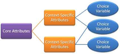
I'm reading the Final Report of the Blue Ribbon Task Force on Sustainable Digital Preservation and Access and I come across the following diagram:
Got it? Crystal clear, isn't it? Aren't you glad you didn't have to wade through a dozen paragraphs of text to get the point?
Oh, wait. You didn't get the point? Maybe the accompanying text will help you out:
Choices available to decision makers are conditioned by core attributes common to all preserved digital assets and those that apply only within specific contexts.
Okay, that helps. We're talking about preserving digital assets, which wasn't at all obvious before. And the point? It's that, when making decision regarding preserving digital materials, some of the factors you consider will be unique to your specific situation, but there are other factors that are true of pretty much all digital preservation.
That's a bit obvious, but a valid introduction to the real point: identifying the "core attributes," those things that all preservation will have in common and so you might as well be aware of right from the start. In this case,
Preserved digital assets share four essential attributes as economic goods.
1. The demand for digital preservation is a derived demand.
2. Digital materials are depreciable durable assets.
3. Digital assets are nonrival in consumption and create a free-rider
potential.
4. The digital preservation process is temporally dynamic and pathdependent.
The most significant point is #3, the nonrivalrous consumption. That's a key difference between digital goods and physical goods.
I just wish to Gog or Hell or whatever that people could make their points without those damned relational diagrams which add not one whit of clarity to the text. In fact, I'm more often slowed down trying to figure out what is supposed to be so damned significant about placing bubbles to the left or right and drawing lines between them. There's some sort of a relationship, but drawing a line doesn't tell me what it is. Drawing arrows instead of lines is usually less helpful than the writer imagines. In this example, why does the "context-specific" attributes sit between the "core attributes" and the "choice variables," and not the other way around? It would make just as much sense to say that the context-specific attributes are mediated by the core attributes as vice versa. Perhaps that's because neither formulation manages to say much at all.
I see these diagrams everywhere and it's very rare that I find one worth the time to look at it, let alone the time to construct it. They say nothing that the text doesn't say more clearly and often in less page space. Can't we be done with this ridiculous fad?
Sigh. Okay, back to reading the report so I can gather the real information contained therein - in the text.


1 comment:
This diagram is particularly bad because there's no distinction between the different "context-specific attributes," giving the impression it's the same set of context-specific attributes, just listed twice, also because they show that even mediated through different context specific attributes you can end up with the same choice variable, undermining their argument that context-specific attributes matter. Done this way, it is indeed nothing more than following a fad. Done right it could have actual information value, but if the intelligent reader can't figure it out without the accompanying text, then it ain't done right.
I suspect you don't get many content-null diagrams like that in physics journals.
Post a Comment