Showing posts with label cartography. Show all posts

Friday, February 18, 2011

Friday photo

Ice on Rock. Hudson Mills Metropark, Dexter, Michigan, February 2011

Last Saturday I finally got out to do a little bit of skiing and decided to check out the Hudson Mills Metropark, a 1500 acre spot of woodlands northeast of Ann Arbor. It's a good thing I did, since the snow began melting that morning and, with several days near 50°, the snow has turned to puddles. In fact, I think we're halfway to flood stage around here.

The park doesn't have much in the way of hills, so the skiing was just a bunch of looping round a 5-mile trail system, with an occasional bit of glide. But there were a lot of novices out and it was fun to watch them approach these tiny little slopes, with their terrifying 5% grades. Knees locked, thighs stiffened, weight thrown forward, skis locked into wedge positions, pushing tentatively on the poles, probing for that point at which gravity will take over and speed them into reckless disaster. It was so cute.

I say that with compassion, because to this day I am not a strong skiier and I vividly remember how helpless you feel when you first bind boards to boots. Sure, you don't get going all that fast on a small slope, but since you have no control yet, anything is too fast. As soon as you begin to glide downhill, you're a passenger. I would regale coworkers with my latest crash: I didn't get my arms and legs fully extended, so I guess it wasn't a proper cartwheel ....

What astonished me after that first winter was to go back after the snow was gone and to realize how gentle many of those slopes were. Not that they weren't racy - there are some good speedy hills around the Old Faithful area. But they still didn't look as steep as they felt. Surely that slope at the bottom of the Fern Cascades trail was 45°, wasn't it? It was so fast! But it's probably closer to a 10°-15° slope.

I spent that summer examining all the hills I encountered with a sort of slideshow in my mind, one that would replace the grass with snow and imagine that I was about to hurtle down on my second-hand Rossignols. It's a funny thing, but the world's terrain just doesn't look as rugged as it feels. Which is why cartographers who want to portray relief often have to exaggerate the vertical scale relative to the horizontal; everything looks too flat otherwise, even in the mountains.

Here's an example by the cartographic artist Heinrich Berann, who did a series of panoramas for the National Park Service. He produced his view of Yellowstone in 1989:

That's a hell of a lot of vertical exaggeration, especially of the Tetons in the distance. But it gives you a more intuitive sense of the shape of the land than a truer representation would. Much like people may be more readily recognized from a caricature than from a photograph, I suppose.

Monday, February 7, 2011

Tuesday, December 14, 2010

The Peculiar Institution - the South

Here's an interesting article in the NYT about a map showing slave populations in the South, compiled from the 1860 Census data - the high water mark for American slavery. And the last time a Census could even compile information on that particular demographic. Historian Susan Schulten notes,

The map uses what was then a new technique in statistical cartography: Each county not only displays its slave population numerically, but is shaded (the darker the shading, the higher the number of slaves) to visualize the concentration of slavery across the region. The counties along the Mississippi River and in coastal South Carolina are almost black, while Kentucky and the Appalachians are nearly white.

Translating numerical data into visual representations is one of the most powerful communication techniques available. The patterns just pop out at you. No wonder people were so taken with this map.

The presence of slavery, and (after 1865) large populations of African-Americans, wasn't the only thing peculiar about the South, though. There was a remarkable absence of foreign-born whites as well. Recently I was poring through the Statistical Atlas from the 12th Census of the United States -- that's from 1900, just to save you the arithmetic -- and came across this fascinating chart.


Click on the "Go to source" button to see it. The chart shows a breakdown of each state's population by race and origin. Four races are listed: Indians, Chinese & Japanese, Negro, and White (corresponding to the "Red and yellow, black and white" that I learned singing "Jesus Loves the Little Children" 'way back in Sunday School*). For whites, there are three further subdivisions: native white of native parents (baby blue), native white of foreign parents (pink), and foreign-born white (green). These were the categories that mattered in 1900.

Notice the states with the longest black lines - those are the Old South, the slave-holding South before the end of the Civil War, and the states that still held the majority of the nation's black population before the Great Migration. And in 1900, a period of intense immigration, most of those states had little to negligible pink and green in their bars. In other words, almost everyone who wasn't black was a white of at least the second generation. In a nation of immigrants, the South drew almost no immigrants.

According to the next couple of Censuses, little changed during the next 20 years. Bear in mind that this is one of the most immigration-heavy periods in US history. Yet the South missed it. They first developed enough of a separate identity to secede from the rest of the country, then learned to resent outsiders all the more intensely -- as you would, too, if you'd suffered invasion, defeat, and military occupation for a dozen years. And then they had the privilege, if privilege it is, of remaining insular while the rest of the country went through the wrenching experience of assimilating people who were as foreign as could be imagined (not only Chinese and Japanese, but Irish, Italians, Greeks, and so forth).

In respect to immigration and Americanism, it was even uglier 100 years ago than it is today. The "hyphenated American" (e.g., German-American) was no American at all, said Theodore Roosevelt, while Woodrow Wilson compared the hyphen to "a dagger that [the immigrant] is ready to plunge into the vitals of this Republic." The 1924 National Origins Act represented an unabashed attempt to keep the US not just white, but lily-white, by limiting the number of immigrants from unpopular nations.

The South didn't need the help, though. Aside from a few Yankee carpetbaggers, unwanted immigration wasn't part of their experience. Other people's families had been there just as long as yours and their brand of religion was probably the same as yours. No one had to accommodate diversity, when there were only two ethnic groups and their status was legally defined.

If it seems at times that Southern culture is especially prone to creating parochial mindsets, and people who steadfastly refuse to accept that not everyone thinks the same as they do -- and that is how Southern culture often comes across to me, at least as expressed in politics and the culture wars -- then maybe this is part of the reason why: no other region in the country was allowed to remain so culturally insular for so long a time.


______________________________________
* Which dates from about the same era, interestingly enough. This piano rendition renders the tune in fine 19th Century style.

Wednesday, November 17, 2010

Beautiful Mother Earth

From the USGS, The Earth as Art:


This is the Dasht-e Kevir, the Great Salt Desert in Iran. Mostly uninhabited, for the same reasons that the Mormons stopped when they reached the Great Salt Lake and didn't continue on to the Bonneville Salt Flats.

The whole display consists of 41 LANDSAT 7 images, selected for their aesthetic qualities rather than for their informational value. Some of the colors will look unnatural, as LANDSAT captures images in a variety of wavelengths of the visible and infrared spectra. My favorites are those that don't get too radical with the coloring, but your tastes may vary (i.e., be wrong).

And if you like these, you'll want to check out the sequels, Earth as Art 2 and Earth as Art 3.

Thursday, October 14, 2010

Making a flat earth rugged

I'm trying to figure out how long this feature has been a part of Google Earth: when you pan a mountainous scene back and forth, you can see it in three dimensions. I'm pretty sure it wasn't always there, but I've been mostly working in the relatively flat Midwest and didn't notice it until now.

You can see it for yourself by zooming in on any mountainous area, or you can download this file and open it directly in Google Earth to find the location seen here:


What you're looking at is Dome Mountain, a prominent peak at the exit to Yankee Jim Canyon, north of Yellowstone National Park. If you use the right and left arrow keys to pan back and forth, you'll suddenly start seeing the landscape in three dimensions. As soon as you stop, it's flat again.

To do this, Google Earth has to continuously distort the image as you pan. The parts of the image that represent the highest elevation are stretched farther toward the edges of the screen, while the lower elevations stay relatively still. As you'll immediately recognize, this is how you experience the real world: when you move, objects that are close to you seem to change position much more than do those farther away.

I underestimated the amount of distortion, until I compared snapshots of the mountain at the extreme sides of the screen. Here I've placed identical circles at the same point in each one, to make for easier comparison. When the mountain is moved to the left (as if you were viewing slightly from the east), see how much more area the east side of the slope seems to take up. In the image to the right (corresponding to a vantage point slightly more to the west) it's the western side that seems very wide and the eastern slope that is narrowed. Notice the treeless, gullied area on the western slope, which is rendered perhaps twice as wide in the right hand shot as it is on the left.


Keep in mind that Google doesn't have multiple views available. It's all the same flat, 2-dimensional image that is being manipulated in just the right manner to mimic what you'd see if it really were 3-D. Through long experience with the real world, your visual system has learned that close things shift position more noticeably than distant things do, so it can be tricked into thinking you're seeing depth, even when you aren't. Google falsifies the image so that your brain falsely interprets what's really in front of your eyes - all to give you a truer impression of what you'd see if you really were floating above the mountain. Cute trick.

Wednesday, October 6, 2010

Ptolemy's map of Germany

An interesting article from Der Spiegel, the popular German news magazine. Go ahead, follow the link - this is the English language version.


It seems that a team of researchers has solved a long-standing puzzle: locating the settlements that Ptolemy, working around 150 C.E., listed with his map of Germany. Unfortunately, the article isn't terribly clear about it, but it appears that he drew rivers and mountains on his map, but listed the settlements separately in a table, with an idiosyncratic way of designating latitude and longitude. If I understand it correctly, it's this system that has resisted deciphering in the present day. However, the group of scholars has decoded Ptolemy's system in a way that matches up not only with many existing cities, but with known archaeological sites as well. If they're right, it would appear that Germany during the Roman Empire was a more heavily populated and cultured place than the Romans reported.

Reading topo maps

If you, or anyone you know, have trouble reading topographic maps, if you just can't make sense of those contour lines and marvel that anyone could read the shape of the land based on all those squiggles -- here's a fine exercise for you.

Check out the New Zealand Topographic Maps, an excellent interface featuring topographic maps overlaid on a Google Maps base. If you select the "Terrain" option, the underlying map will switch to shaded relief, a portrayal that's less precise than contour lines, but gives an easy-to-interpret sense of the shape of the landscape. By moving the slider back and forth, you can adjust the transparency of the overlying topo map and switch seamlessly between the shaded relief and the contour lines. Try it out!


(Also, zoom in on some of those coast lines and note how accurately the topo maps fit with the satellite image. I was impressed.)

Monday, June 14, 2010

Streets of San Francisco

Strange Maps presents a few 3-D renderings of crime in San Francisco, using elevation instead of colors or shading; check it out:


If you want a hooker, you have to go downtown, but you can get your car stolen anywhere.

Thursday, June 3, 2010

How big is that spill

Here's a site that lets you compare the size of the BP oil spill to your home town county state:


Via Maps-L listserv

Wednesday, May 5, 2010

California in text

Here's an interesting map that illustrates a bit of gestalt psychology in its portrayal of California:


The image is created of text, with the name of the each county repeated within its boundaries to create the image. Each letter is colored to represent the land type at its location, and the letters are spaced closely together to represent high elevation and more widely to represent lower elevations. The brain easily picks out these patterns and has no trouble spotting the wide spacing as the low central valley area, the brown deserts, and the wavy "Ocean."

Here's a link to a larger image (warning: large PDF). You can see some other interesting maps at the Bizarre Map Challenge Awards List.

Tuesday, March 30, 2010

All the world's your apple

From the Maps-L listserv and artist Kevin Van Aelst:


(Am I being unkind to wonder why the artist had to follow a Mercator projection, which makes Greenland look bigger than South America?)

Thursday, March 11, 2010

ZIPScribble Map

From the maps-L listserv:


I'm sure you instantly recognized that this was drawn by connecting every US Zip Code, in numerical order. For more info, plus a color version, check out eagereyes.org.

Thursday, February 18, 2010

Then and now

A couple of weeks ago I posted on the Flickr pool "Looking into the Past". I'm getting a chance to do some similar work now:


One of our librarians wanted to create a poster of an "architectural history" of medicine at the University of Michigan, displaying photos of major medical buildings. I'm taking that a step further: creating photos that juxtapose the past with the present, and a KMZ file that can be displayed in Google Earth to locate each building's footprint on a current map.

I start with a Sanborn map fitted to the street grid and any still-existing landmarks. Then I plot the shape of the buildings according to the map, like so:


After that, it gets complicated. I can measure the true dimensions of a building and compare that to the apparent dimensions of the same building in a photograph to calculate the angle at which the photographer was viewing it. Or, as in the photo at top, I might be able to see the corner of one building lines up with a certain section of another building or landmark. If I have more than one line, I should be able to triangulate a nearly exact location for the camera:


Of course, it's not really exact, due to errors in my calculations, my alignment of the Sanborn map, and small inaccuracies in the Sanborns themselves. But it's surprisingly close and saves a lot of time when I go to reshoot the scene. When you're trying to match up two photographs, it only takes a small difference in vantage point - like ten feet - to spoil the effect, so if I had to do it all by guestimating, it would take an enormous amount of trial and error before I found the correct spot.

Even then, the trouble isn't over. The new photo and the historic photo have different dimensions, so one of them will have to be resized. How much? It can be tough to tell. In the example above, I originally had the old buildings much too large and only realized it by comparing the sizes of the two figures on the sidewalk. After I made the adjustment, I went back to Google Earth and drew some new lines, confirming that yes, most of the third building would have been visible around Angelo's restaurant.

Here is what the scene looks like today, with the Taubman Medical Library partially obscured by Angelo's:


The historic photo, showing the University Hospital in 1915, can be seen here at the Bentley Historical Library site.

Thursday, January 28, 2010

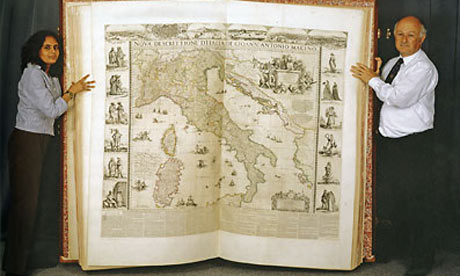
Largest book in the world goes on show for the first time

"It takes six people to lift it and has been recorded as the largest book in the world, yet the splendid Klencke Atlas, presented to Charles II on his restoration and now 350 years old, has never been publicly displayed with its pages open."

I might have written "therefore" rather than "yet."


Via the Maps-L listserv

Tuesday, January 19, 2010

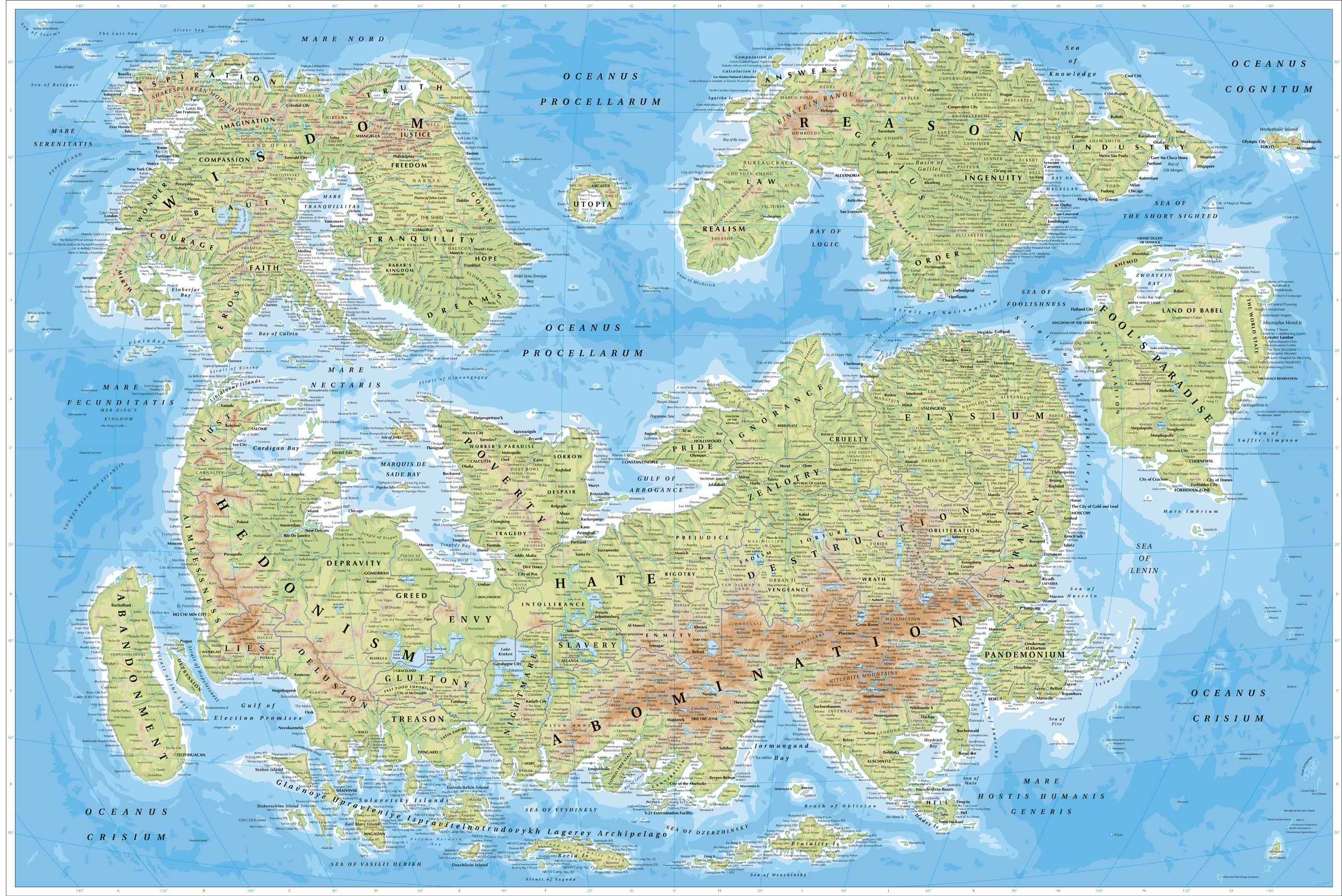
The Map of Humanity

Someone has put a lot of work into this "Map of Humanity," which is as fanciful and speculative as 15th century maps of the New World. Is Faith really on the continent of Wisdom? I kind of think they're as far apart as China and Hispaniola, to be honest about it. And how disturbing to see Ann Arbor as a neighbor to Salt Lake City (near 40 W, 60 N), either geographically or culturally.


From James Turner, the creator:

The continents of this restructuring rest upon the sea of the unconscious, the stormy basis of our thought. The land that emerges from it is broken into three main continents, each related to an aspect of the human mind: superego, ego, and id.

So it's a Freudian world. That would account for the three continents being so improbably distinct from one another. If I were to try something like this, I'd probably create one super-continent, where the nasty parts live cheek-by-jowl with out "higher" aspirations.


Via Dark Roasted Blend and the Maps-L listserv.

Tuesday, January 5, 2010

Life, the universe, etc.

On the Maps listserv, Brendan Whyte of the National Library of Australia points to this atlas of the universe from the Hayden Planetarium:


Also check out the FAQ's, where you'll find interesting answers to questions like "Why should life be carbon based?", where Saavik Ford explains how carbon atoms have the ability to bond with four other atoms at once, thereby making long and complex molecules that are capable of causing interesting chemical reactions.

Saturday, October 10, 2009

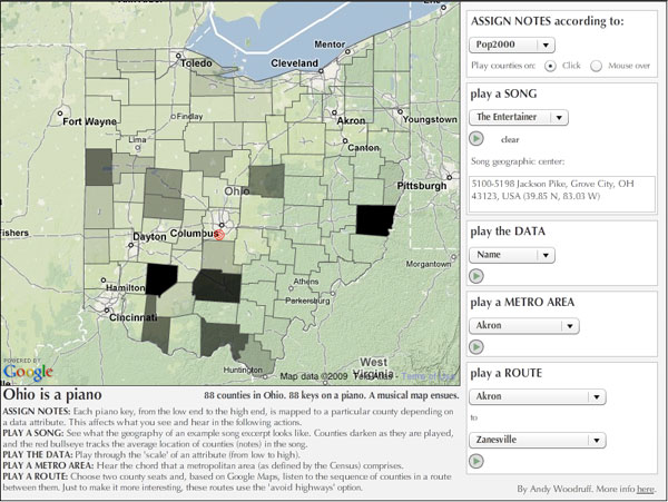
Patricia sent me this link of Ohio as a piano. Andy Woodruff at the Cartogrammer.com blog has seized on the coincidence that there is exactly one Ohio county for each key on a piano and mapped the sounds to the map so that clicking or mousing over a county plays that note.

Where it gets interesting is that you can remap the sounds, according to the available GIS data. Low values play low notes, high values play high notes. Most of the music is too John Cagish for my taste, but I liked the Crop Acr97 mapping, where you can literally hear Ohio grow more farmable as you move southeast - northwest.

Tuesday, September 29, 2009

Mapping banned books

From the Maps listserv, here's a Google Maps plotting of banned books ( as compiled from the ALA's "Books Banned and Challenged 2007-2008," and "Books Banned and Challenged 2008-2009," and the "Kids' Right to Read Project Report"). How does your neighborhood compare?


I notice that not every item on the source lists seems to be plotted, so maybe Utah isn't as clean as it looks. Still ... didn't you think there'd be a few markers there? Maybe I should give more credit where credit is due.

Despite a certain incompleteness, someone has made the map pretty informative. As you mouse over the markers, it pops open some copied-and-pasted text that describes the incident behind the listing. Some of the usual suspects are there, including Philip Pullman and JK Rowling; also, someone considered Craig Thompson's Blankets too sexy and had it moved from a young adults section. Someone else thinks Of Mice and Men is an offensive load of crap and shouldn't be read. In general, bad books are those that mention sex, contain swear words, and don't flatter Christianity.

Of course, I'm not always completely on-board with the banned books lists, as they tend to lump every type of "challenge" together in a single category. Some parents question whether a books is age-appropriate, not whether it has any value. I might disagree, but it's a fair question.

I'm also slightly open to complaining when books are assigned reading. I'm not really opposed to children being forced required to read things they might not otherwise encounter, but even a schoolteacher doesn't have complete authority to override parental wishes. I think it's a bad impulse to complain - giving a child a book is not an effective brainwashing technique, but shielding them from any message but your own is. So I disapprove , but the parents aren't necessarily outside their rights.

Then there are the demands that books be removed from library shelves. That's entirely wrong, period. You don't have the right to demand that no one else's child be allowed to read a book.

Tuesday, September 8, 2009

Via Pharyngula, I learn that Al Franken would know where his towel is, no matter where he left it:


That has to be some parlor trick he developed as a smart-ass kid.

Monday, September 7, 2009

New York prehistory

This month's National Geographic has an article featuring the Mannahatta Project, a recreation of Manhattan's natural environment. The project started by geolocating the still-extant sites on the British map of the island, prepared during the Revolutionary War, and built from there back to 1609, when Henry Hudson became the first European to see the place.


The website is built around the Google map of Manhattan, but with an extra layer representing a visual image of the landscape as it likely appeared in 1609, plus popup descriptions of the local ecosystem. You should definitely try it out.

I've posted a quickie-demo here.

The project was also featured in the New Yorker a couple years ago.